20071031

20071030

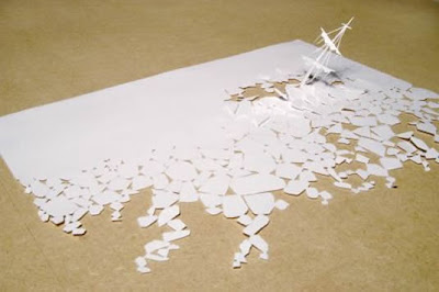
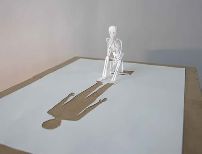
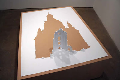
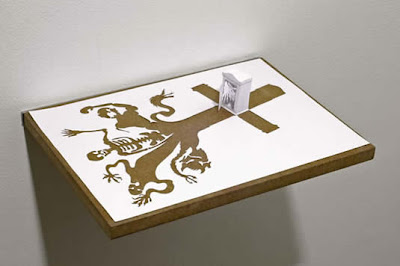
Papercut by Peter Callesen

Closet Eismeer
Looking Back
Erected Ruin
Peter Callesen, a Danish artist with steady hands and far too much time on them, produces a confusing range of different media. His papercuts, ranging in size from A4 80gsm to the size of a garden shed, are based principally on the theme of paired opposites of significance - cradle to grave, inside to outside - and executed with a deftness that produces the surreal effect of polished, pristine, well-packed snow. Which, incidentally, he also uses a lot of. His website, PeterCallesen.com, exhibits papercuts, installations, performance art and works with ice, snow and water.
The papercuts are, almost without exception, delightfully intricate and witty. His sketches, on the other hand, are rather disturbing - and yet nothing in comparison to his profoundly moronic performance work, which is presented in the form of loosely animated GIFs. 'The Dying Swan is Dying', a title which one vainly hopes was somehow lost in the translation, appears to comprise 25 minutes of Callesen arsing around in a cheap purple knock-off of the Big Bird costume, his own snow-white underwear, purple tights and red Converse All-Stars; he proceeds to draw a poor stick figure on a wall and apply a rusty saw and hammer to various objects occulted by the low image resolution.

Viewer discretion is advised.

also on aS.blogspot

Yayoi Kusama


As Wikipedia would put it, 'her work shows some attributes of feminism, minimalism, surrealism, Art Brut, pop and abstract expressionism, but she describes herself as an 'obsessive artist'... She has long struggled with mental illness'. Another choice narratives describe her as 'aided by a self-ironic narcissism yet devastated by an obsessive sensitivity'; this from an exhibition listing at the Galeria Civica in Modena, where the suspect quality of the English demonstrated by 'ensconced in the artistic ferment of New York, she took an active role in the happenings for peace in Vietnam' is rife but not instantly obvious due to the florid interpretative language.

Kusama herself could be sensitively described as a 'character' - her highly eccentric style of dress, mirroring her art, has transformed her from a kind of Japanese
Björk in the 60s to the rather gender-ambiguous clown on the cover of this month's Art Review.


Before


After


The listing from
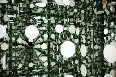
Kunsthaus Zürich, where one of her pieces - The Passing of Winter - was shown as part of the Expanded Eye exhibition, comments on the labyrinthine theme of the work in the exhibition; 'trasformata in un divertente labirinto', as Galeria Civica puts it. This might well be the most credible way of describing the impact of her installation work, with its disorientating, chaotic uniformity; the infinite variety in the size and proportion of the shapes distorts perception, creating a surreal dream-like ambience. Less a House of Leaves than a house of dotty psychedelia, substituting high impact for winding subtlety, but exceptionally memorable nonetheless.

The other credible way, heavily implied by other critics in less basic terminology, is the woman clearly has issues with dots. Lots and lots of dots. She apparently suffers from hallucinations of dots, and thus - rather logically, and yet clearly some reasonable distance from actual logic - covers things with...yes, dots.

But yes, the woman likes dots. See many, many more dots at her official website, YayoiKusama.jp, the Galeria Civica website and the PBase photo gallery of the Dot Obssession exhibit. There is also an impressive and slightly less abrasive (though equally dot-infested) site on the making of a documentary on the artist, Kusama: Princess of Polka Dots. An overenthusiastic Spanish person also keeps a very devoted blog following her work on Blogspot, and Image-Googling Kusama turns up an impressive selection of high-resolution pictures of her works.

Cultureblog: Atlas by Jorge Luis Borges and Maria Kodama


The above image from the now out-of-print Atlas, published in 1984 shortly before his death, is the collaborative work of Jorge Luis Borges and his assistant Maria Kodama. Scans of the photographs are, inevitably, rare and of disappointing quality but they demonstrate a poignant sensitivity to the author, now blind from glaucoma. The above image, showing Borges examining the inscription on a Japanese obelisk is courtesy of the Garden of Forking Paths, currently the most comprehensive Borges resource online.

For the interested, the University of Iowa is compiling a very impressive, more academically focussed resource to incorporate scholarly discussion on Borges' work and, in the unforeseeable future, texts of his work at the Borges Center.

Also on aS.blogspot

20071023

Fred Eerdekens


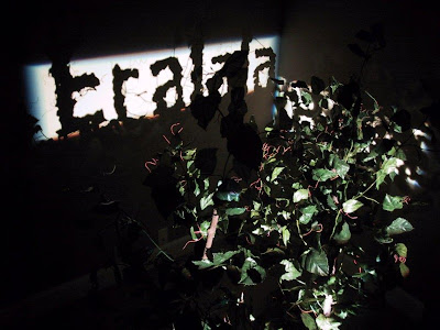
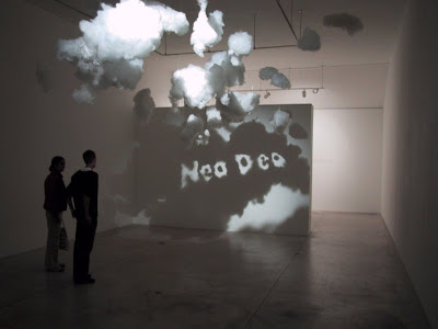
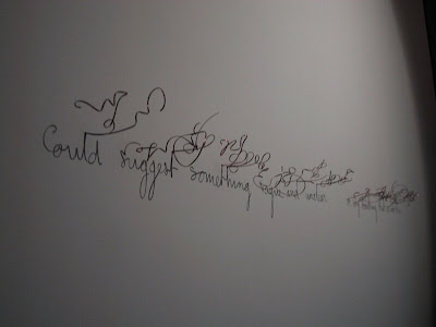
Fred Eerdekens installation work is based on the concept of projecting a strong beam of light through structures that appear integrally sound in their own right to cast perfectly formed words in shadow on the opposing wall. In the Photoshop era this kind of work suffers from a strange ambivalence of a diminished initial impact followed by a swiftly flourishing sense of wonder. The real charm of his work is in the innocuous nature of the sculpture pieces, no more abstract than anything else we are encouraged to consider as art; and as far as technique goes, the shadow-writing itself has a surreal sharpness and quality of composition and proportion. It is difficult to accept at first that there is no technical deception involved.

As far as the artist himself goes, Fred Eerdekens has not yet made Wikipedia's eponymous List of Belgians - my knowledge of Belgian culture does not extend to assessing the standards by which the others made it on to the list, although the creator of the list states the following as potentially validating characteristics for entry:

  • fictional characters who are undisputedly Belgian
  • important ones whose citizenship is unknown or not Belgian and with Belgian creators.
Whilst his work has been frequently exhibited he does not appear to have much notoriety in his own right. I suspect that this is because his work is more technically and aesthetically interesting than anything else; not to say that it lacks significance, since some of the pieces have a clear message that draws on the idea of a sculpture containing a hidden message which the beam of light reveals.

To see more photographs and angles you can try his website, although as the images in this post may demonstrate the resolution of the photographs is not all it might be.

20071022

Andrew L. Moore [I : Russia]


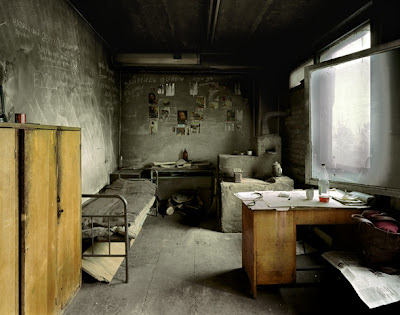
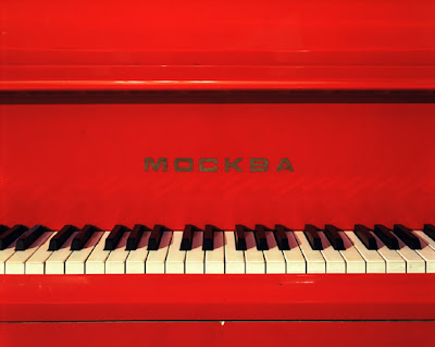
Andrew L. Moore has, deservedly, the most illustrious CV of any photographer I have ever come across. He has lecturer, published, given interviews and blogged for the better part of a decade, and you will be hard-pressed to find a single mundane or substandard image in his beautifully maintained website galleries. He has published images in regional collections that show a broad, sensitive cultural nuance in each case - the kind of images that make anyone wonder how in hell he found the scenes he photographed, never mind executed each composition with such casual technical finesse. He explains the process of obtaining access to the hidden niches in his interview with Conscientious Blog : Although one method is to work through diplomatic channels to gain entry to controlled places, my approach has always been to fly below the radar, so to speak. The first thing I try to do is find someone who has the contacts, charm, and curiosity necessary to get things done in a bureaucratic maze, as well as someone who understands what kinds of pictures I'm trying to make. Clearly I should stop narrating before you begin to suspect that I've been paid for such an unashamedly positive review of his work, but aside from a certain lack of close work on human subjects, his galleries really want for nothing.

The same cannot perhaps be said of his films, all of which are available to view in sample size on his website, which would appear promising from the quality of his still work. Confusingly they are, in fact, rather amateurish and pedestrian, full of inappropriate cuts and generic music, but perhaps a point of interest to the curious.

Futebol features small South American children kicking an old ball around to sentimental soundbites and hyperactive drums. Vito, unless it's an exercise in irony, is a rather self-indulgent piece of pretentious w*** feautring an artist chain-smoking and discussing his installation work at the English department of a university: 'what we wanted to do was enclose the existent...spheres...into a kind of...field...of spheres...like an invasion of the killer tomatoes'. Swimmer, Slideshow and Gotham are basically just images with tacky, outdate transitions and irritating music. How to Draw a Bunny, a feature-length documentary on artist Ray Johnson, appears to be characterised by the same irritating pretentiousness, mundane 'creative' dialogue, substandard transition editing and inappropriate music; the film apparently picked up the Special Jury Prize at Sundance 2002, however, so perhaps there's some redeeming quality to the full-length version.

His website is at andrewlmoore.com.

20071019

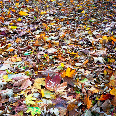
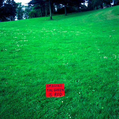
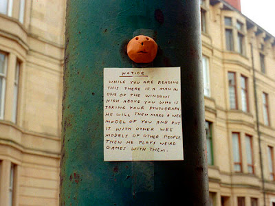
Photography by David Shrigley


On the subject of context-based art (I want to say 'installation', but I refuse to believe that a piece of paper can be 'installed' anywhere...now a framed piece of paper, that's an installation...) David Shrigley may be better known for his original combination of highly incisive wit and a complete and total inability to draw, published as the Book of Shrigley, but he has since broadened his horizons beyond his deformed felt-tip figures. His website is seriously worth a thorough browse; his ideas are insanely clever and beautifully captured.

20071018

Tape Sculpture by Mark Jenkins


Mark Jenkins has a dream, and that dream is to fill public spaces with strategic, humorous, disposable objects and photograph their adoption into local society. Whilst his photography is a little flat and bleak, some of the images are pretty priceless; there's a substantial collection on his website. For anyone interested in making some low-overhead public art themselves Mark also maintains a tutorial website at tapesculpture.org.

Cultureblog: Cantor Dust on the Sierpinski Carpet


The Sierpinski Carpet is a plane fractal representing the ternary Cantor set extrapolated into 2-dimensions. Besides being a rather attractive rug pattern, like the other 2-D generalisation, Cantor dust, the 3-D extrapolation Menger sponge and the ternary set itself, it has zero measure.

In the Cantor set, starting with a unit length (ie. any length, with one end of the line being point 0 and the other being point 1) you divide the length into three equal segments and remove the middle third, and continue to infinite iterations.


Since the sum of the removed parts tends to infinity the set has zero measure, although clearly some parts of the segments are never removed, so it also contains an infinite number of points.

In the Carpet the central square piece is removed from a square sliced into thirds horizontally and vertically; the area tends to zero and the total perimeter of the holes tend to infinity. For some reason, this is pretty damn awesome.

20071017

Guy Bourdin


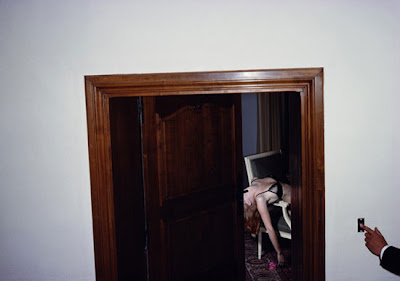
Guy Bourdin, one of the 'best known photographers of fashion and advertising of the second half of the 20th century' according to Wikipedia, states his case for fashion photography as art with a plush elephant and a dead hooker. This is a man with unrealised dreams of shooting in a morgue, using cadavers as models; rather an unashamedly telling attitude to the industry. A few of his pieces are available to view at his website, and more here; in case you were wondering, the 'Surprise' section might be appropriately retitled 'unrewarded curiosity'.

Apparently, David Bowie has an opinion. Here it is. For a concise summary, read the italics :

Since the advent of AIDS and the new morality, and, of course his death, his dark sexy fatal style had fallen out of Vogue. An uncompromising photographer, he had found a twisty avenue through desire and death. A white female leg sticking gloomily out of a bath of black liquid enamel. Two glued up babes covered in tiny pearls. The glue prevented their skins from breathing and they pass out. 'Oh it would be beautiful,' he is to have said, 'to photograph them dead in bed.' He was a French Guy. He had known Man Ray. Loved Lewis Carroll. His first gig was doing hats for Vogue. He'd place dead flies or bees on the faces of the models, or, female head wears hat crushed between three skinned calves heads, tongues lolling.
What was this? Fine Arts? The surrealists might even think his work passé. Well, it was the `50s, that's what it was.
The tight-collar `50s seen through unspeakable hostility. He wanted but he couldn't paint. So he threw globs of revengeful hatred at his nubile subjects. He would systematically pull the phone cord out of the wall. He was never to be disturbed. Disturbed. Never. Everything and everyone died around him.

Giovanni Zaccagnini


Giovanni Zaccagnini, a 30-year-old Italian fashion photographer, immediately raises the question of whether fashion photography can be considered art. Clearly the more widely respected photographers of the genre will be those take the concept into more creative and abstract realms than the GQ formula, but as a rule, how many truly hideous pictures can you take of a beautiful woman wearing very little on a carefully dressed set? And is it even possible to somehow photograph more than that, to capture something significant amongst the shiny ornaments selected and artfully arranged beforehand? Cynically, fashion photography seems to become Art only after the style it captures lapses into the past and becomes a cultural artefact. Still, as I say - half-naked women, well-paid photographers, expensive sets. It's the MSG of photography.

Zaccagnini's website offers a lot of images, but his composition skills seem to falter at the digital level. Most of the images are scans of magazine pages and the layout is pretty basic and uninspired, although it succeeds in functional terms. His brief biography reveals all you might already have guessed from the minimal text content -

After finishing high school I went and leave in NY looking for work, adventure and also to learn english better.

When I came back to Rome after a while, I started working and studing at the same time. After one year I went to Naples to see the exibith of Mario Testino. That's when he asked me to go and work for him in Paris.

I went and after 3 years of assisting, I decided I was ready to go my way.


20071015

Joaquín Bérchez


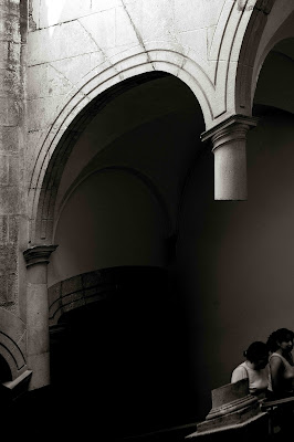
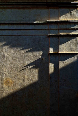
Joaquín Bérchez, a well-respected Spanish photographer specialising in eye-bleedingly high resolution images of small architectural features with sharp, profound lighting and texture has the rare gift of literally bringing stone to life. However that sounds, it is no sweeping compliment; his eye finds innocuous features in monumental structures and brings them into intense focus, creating a curvaceous maddalena from a twisting pillar and a labyrinth from a geometric wall-etching. A frustratingly limited but extremely well-tended collection of images can be found on the website for the Centro Internazionale di Studi di Architettura Andrea Palladio, from his exhibition Proposiciones Arquitectonicas. Several more are available from his exhibition at the Colegio Mayor Azarbe.

If you plan on using a search engine to search for further images, be aware that his name proliferates in every possible variation on spelling and accent, his works are often inexplicably retitled for the country of exhibition, and the Cisa Palladio exhibition is often listed under the Italian translation of the title, Proposte Architettoniche.

Akif Hakan Celebi [II]


If you needed any more convincing to go here...

20071014

Akif Hakan Celebi


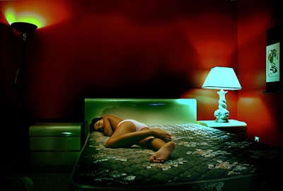
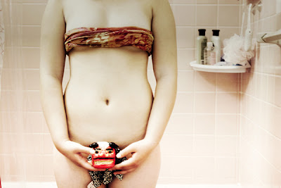
As a brief visit to Hakan's website will show you, he is a lot more prolific and talented than available image files can demonstrate, if rather single-minded with his subject matter. The images above are taken from the albums Bathroom Rituals and Tranquility and his entry to the International Colour Awards, At Night.

Mario Leko


More images from Croatian photographer Mario Leko at his fotocommunity gallery and his slightly chaotic and pretentious myspace page.

20071009

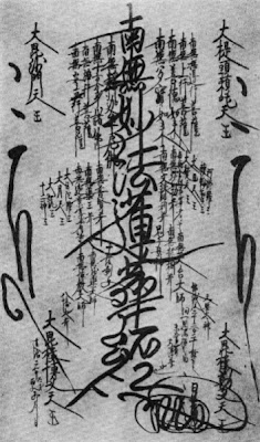
CultureBlog: ご本尊, 御本尊 (Gohonzon)


Gohonzon are a type of script mandala (文字漫荼羅, moji mandala) that are
the primary object of veneration in various Nichiren schools of Japanese
Buddhism. In private settings, they are usually housed in a Buddhist altar;
photography and reproduction of the gohonzon is discouraged as the
resultant images are unconsecrated and vulnerable to damage.

More (unconsecrated) examples can be found at the Buddhist Dictionary.

20071005

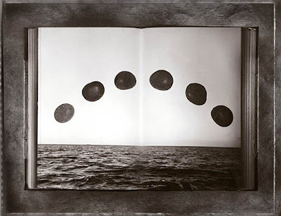
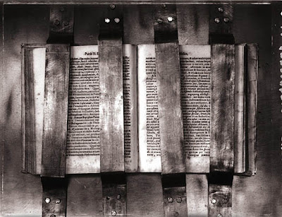
CultureBlog: 'The Secret Books' by Sean Kernan


Unpublished photographs produced by photographer Sean Kernan
in illustrating The Secret Books, collecting three stories (The Library
of Babel, Borges & I and The Book of Sand) alongside Borges' poetry.

These unused images are displayed at the Garden of Forking Paths'
website. Many of the published images are used in the book's website.

More of Sean Kernan's work is available to view at his studio website.